And of course I'm going to play art critic because why not? I don't have much to do as of this post. But anyway, for the sake of maintaining some atmosphere of positivity, I'm going to focus on his weakest works to the best ones since what else to end it on a positive note to celebrate a revered and respected franchise?
And before continuing, must note that I'm using my preferred nicknames for the games listed that don't have the Solid in them. Why? because that's how I wished they were called; it pays to have watched AVGN's video on the inconsistent sequel titles and I figure I would follow his words on them since I agree with him but that's another topic for another time.
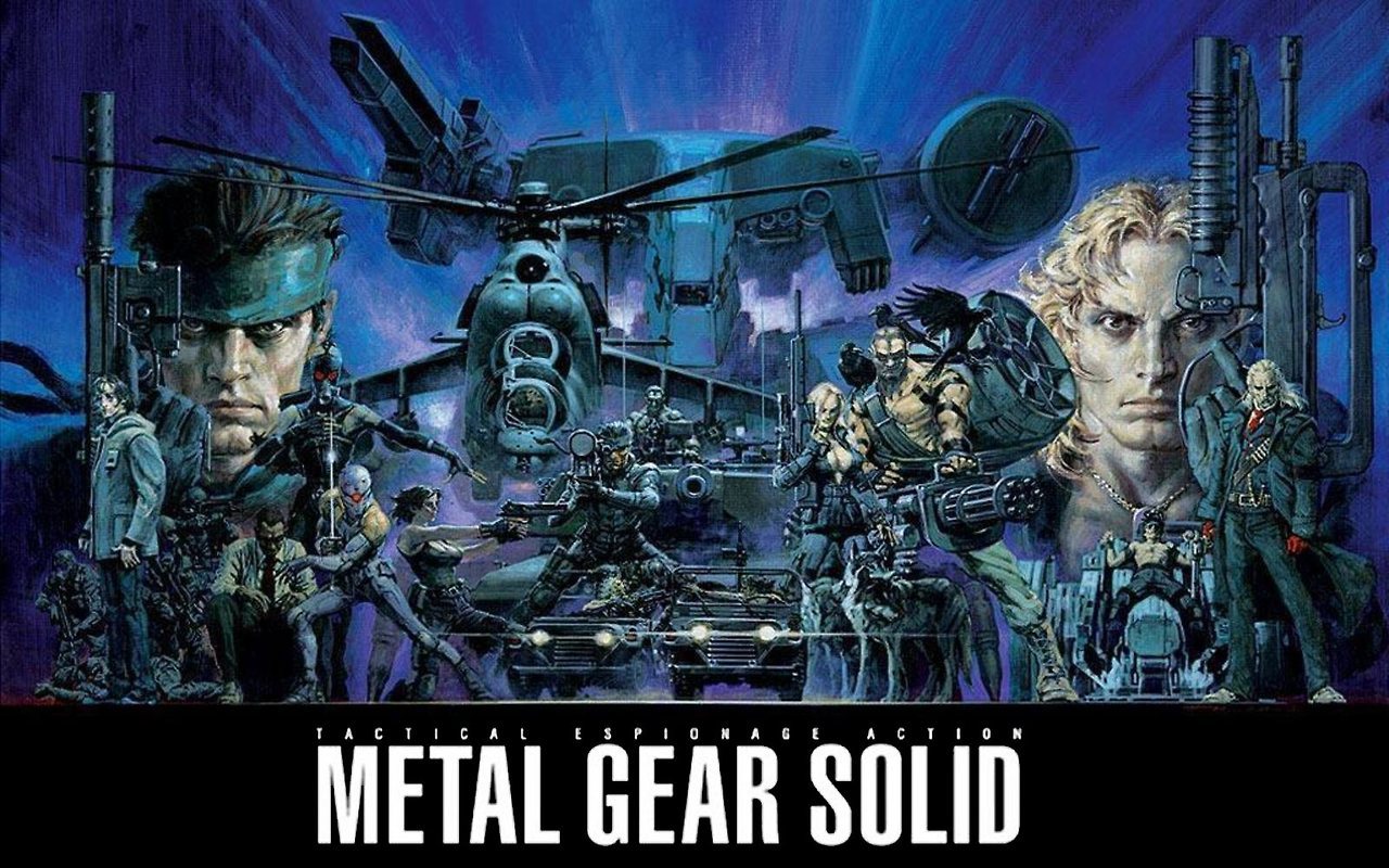
So let's start on his cover for Metal Gear 4: Sons of Liberty (AKA Solid 2):
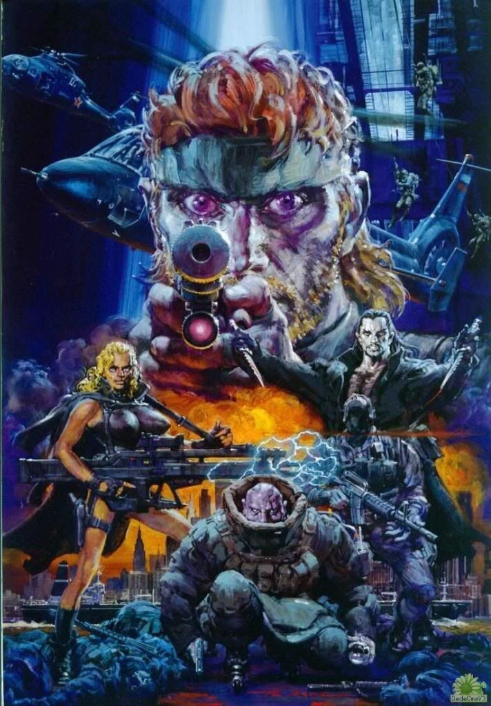
Good lord, it could some work; Snake looks like he's on crack or some other stilumant drug. That or he took way too much meds to keep himself awake. And I get it we all need something to keep ourselves awake in our times we're active but this just doesn't sound right. Also isn't he supposed to have his left eye shut for accuracy? And they appear to be purple for some reason as well as his face but moving on. Fortune's boobs look like freakin' torpedoes (and bigger than they were in the game!), not that I think it's a bad thing (and in fact it's a plus in my book) but of course that plus is outweighed by her legs looking too skinny for her physique and her face making her look like Michael Jackson to an extent. Fat Man seems to be either lacking a lower torso and his arms look bigger than they should be in the games but maybe it's the perspective of him crouching; not to mention his face looks purple for no reason (almost like a purple people eater!). Vamp looks alright, though him behind a hapless SEAL dude threw me off for a while, making me think he's either part of Dead Cell or "Snake Plisskin". A little odd that the cover depicts his death which seems a little violent to me but whatever, preferably I rather have his corpse slumped in front him or held up and having his blood sucked out like that one scene in the game. Overall, outside of those flaws, everything else seems alright, though those Gurlukovich Soldiers on the top right corner look like they're astronauts floating in space (to quote Pennywise, "They float...they all float").
Another cover for MG4:
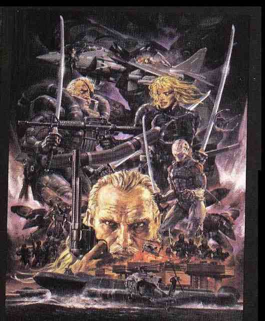
Yeah another flawed one, though this one seems slightly better IMO. Raiden looks like he's either on botox or a member of Deathklok (or even that one black haired dude who's name escapes me); and his hair is blonde for some reason. Solidus Snake, while he's alright in terms of the depiction, looks like Ogma from Metal Slug 3D and his eye seems to have lost his pupil (perhaps it's due to the resolution displayed). Revolver Ocelot, while also drawn fine, looks almost like a different person and where it not for his SAA revolver, I probably would be confused as to his identity. "Mr. X", the blatant expy of Gray Fox, looks like he's having bowel problems and resisting the urge to go to the bathroom, almost like what Johnny Sasaki and his relatives constantly have. Over than those flaws, again everything seems alright.
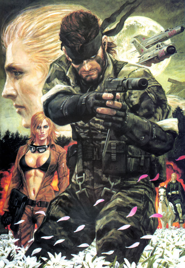
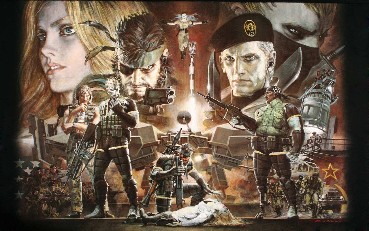
On to the cover for Metal Gear 5: Snake Eater (AKA Solid 3):
Well this one seems to be more of an improvement over the over two but still some minor nitpicks. For one, Eva's face makes her look like she's in her thirties, but at least she's rocking that rack if you know what I mean. Also the Boss's gun looks slightly different than it was in the game and her eyes seem blackish for some reason like she's getting posessed. That and it seems to be cut off from the left edge, making it almost incomplete, otherwise I would be ranking this as one of the better covers Ohrai made.
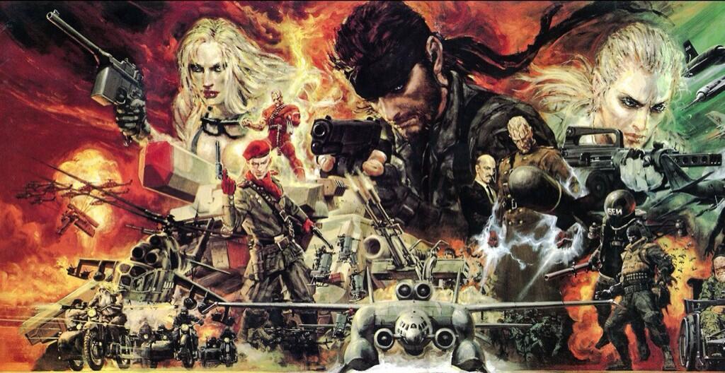
Another cover for Metal Gear 5:
Another good one, and it seems more complete so to say. Though one flaw is the redundant use of the Boss in this, I know the rest of the entries repeat some of the characters over and over but this one to me feels unnecessary. Personally I stick with just having the Boss in the background and not also in the bottom right corner riding her horse; it should have been just the horse itself for all I care. That and Eva's right eye is slightly crooked, but it's pretty minor to say the least. Otherwise, a pretty good pic from Ohrai-san.
The cover for Metal Gear 3 (AKA Solid 1):
While predating the previous entries, this one seems to be a lot better and on par with the first cover for MG5. It's safe to say this might be one of my picks but I'll get to that later. Not only is this well drawn, but the composition is clear as hell to me; I can make out what side is the protagonist's and what is the antagonist's and it seems to be like getting the viewer on the edge of his/her seat. Though Liquid Snake's hair seems alitte short or that he seems slightly balder than he is, making look like John Smith from Disney's Pocahontas. That and Otacon's hair looks girlish for some reason but those are about it. A stunning work for a stunning game, that's pretty fitting so to say.
The cover for Metal Gear: Portable Ops (though I must disclose that I have not played the game yet though I have a PSP now and I probably should seek out a physical copy of it, and that I might not be able to know the names of some of the characters involved):
Now this one might be another top pick for me as this not only showing a clear composition about the sides involved but also seems slightly more action packed but not completely constant. Though again some nitpicks, like that dead woman Big Boss is next to seems white as snow for some reason and that the Cunningham guy seems fat (though maybe he's like that in the game). Over than those details, this one is great and on par with the last one. Though the guy with the white headband (who might be Roy Campbell if I remember) looks like Marco Rossi and that the gal in the middle with blue hair reminds me of Alice from that meh Metal Slug Attack game for some reason. I don't know why I needed to type that last sentence out but that's just a hunch I have.
So in conclusion the first two are weak, the middle two are fine (though the first one had potential to be part of the best), and the last two are superb. And if you ask me the best one out of all the covers Ohrai made, I'd say the one for Metal Gear PO takes the cake since it manages to be action packed and getting the viewers more effectively with most of the characters seeming to get ready to fight at a moment's notice.
Happy 30th Anniversary, Metal Gear! May you hope to be...um, remembered fondly by those that played the games in general.
Sources: http://videogamesdensetsu.tumblr.com/post/162906640390/noriyoshi-ohrai-生頼-範義-november-17-1935
